Live project / 01
Alugue+
Rental,
in focus.
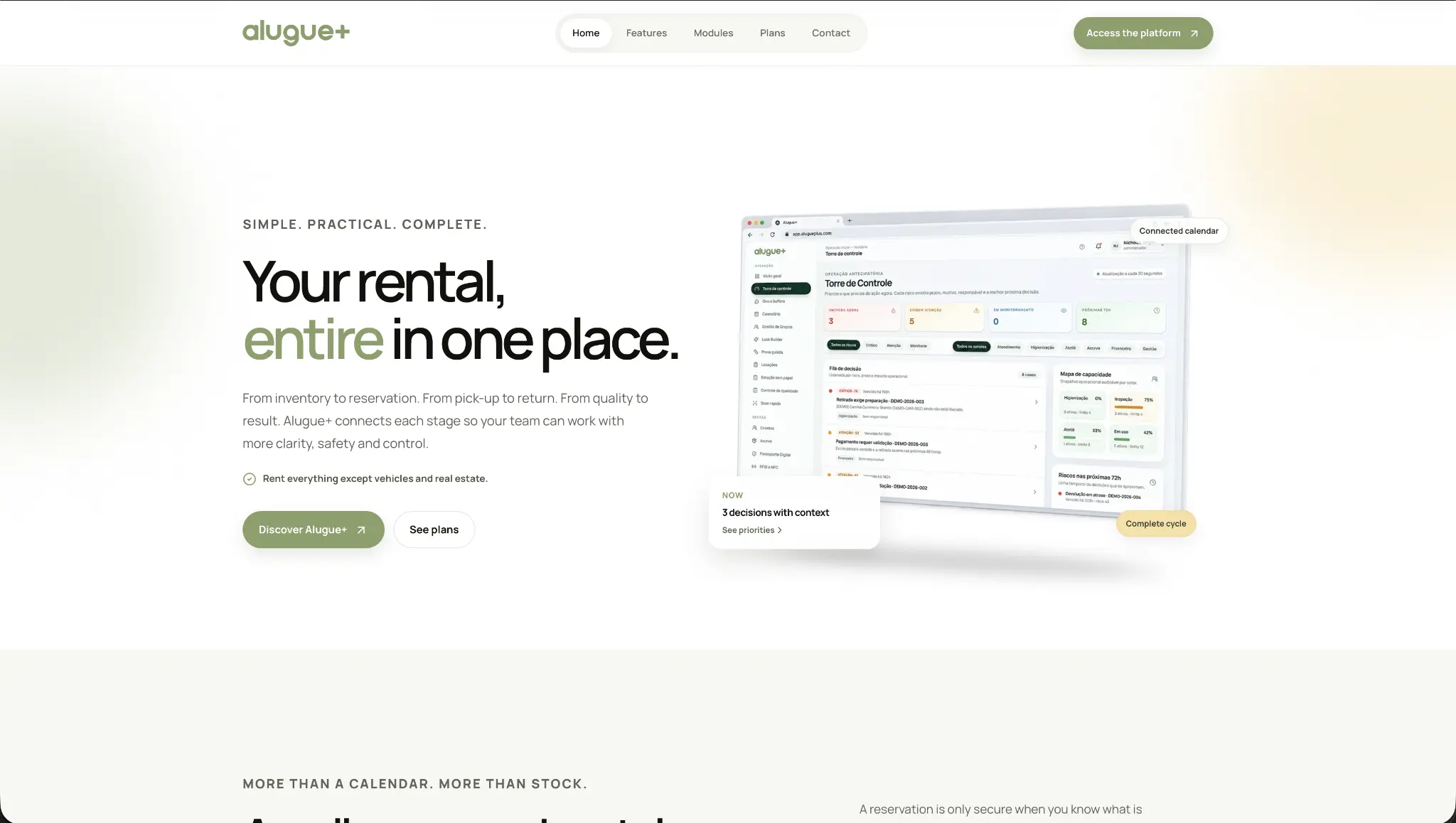
Alugue+ is a management platform for companies that rent physical items. One connected view for inventory, reservations, preparation, pick-up, return and quality.
TreeDee shaped the English product website into a calm, clear journey through that full operation.
A detailed operation.
Made easy to enter.
Rental teams need more than a calendar. They need to see what is available, what is committed, what needs preparing and what needs attention before it becomes a problem.
Alugue+ brings that context together. The site had to do the same: introduce a sophisticated product without making the visitor work to understand it.
- Product
- Rental management
- Audience
- Physical-item rental teams
- Experience
- English product website
- Structure
- Inventory to quality
Design direction
Quiet by design.
Clear by default.
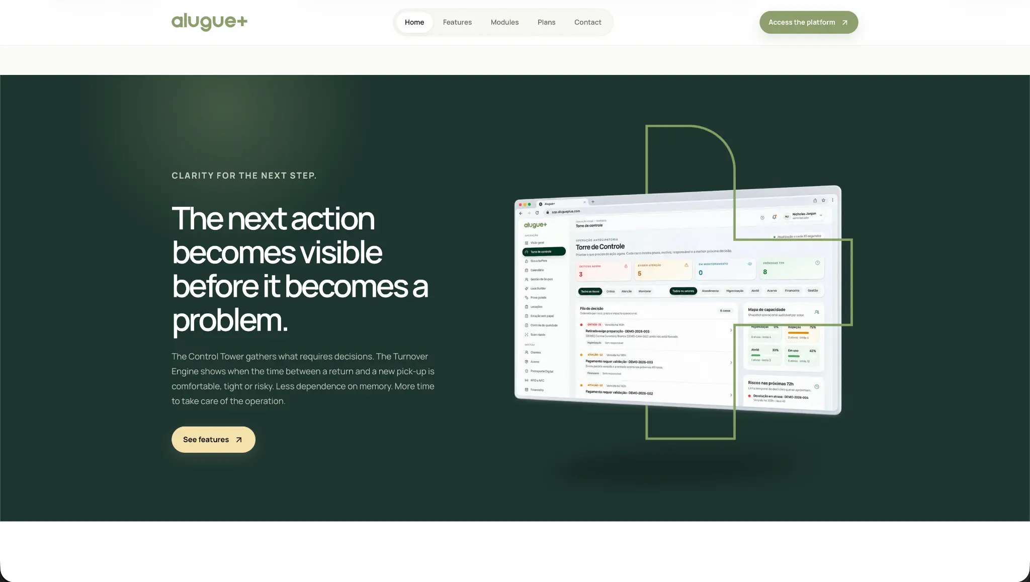
We built a product narrative with room to breathe. Large interface moments, concise copy and a steady visual rhythm let the platform feel capable without ever feeling complicated.
A light foundation gives complex information space to settle.
A restrained olive signal guides action, status and confidence.
Deep sections create contrast when the story needs weight.
Flow and usability
Every view answers
the next question.
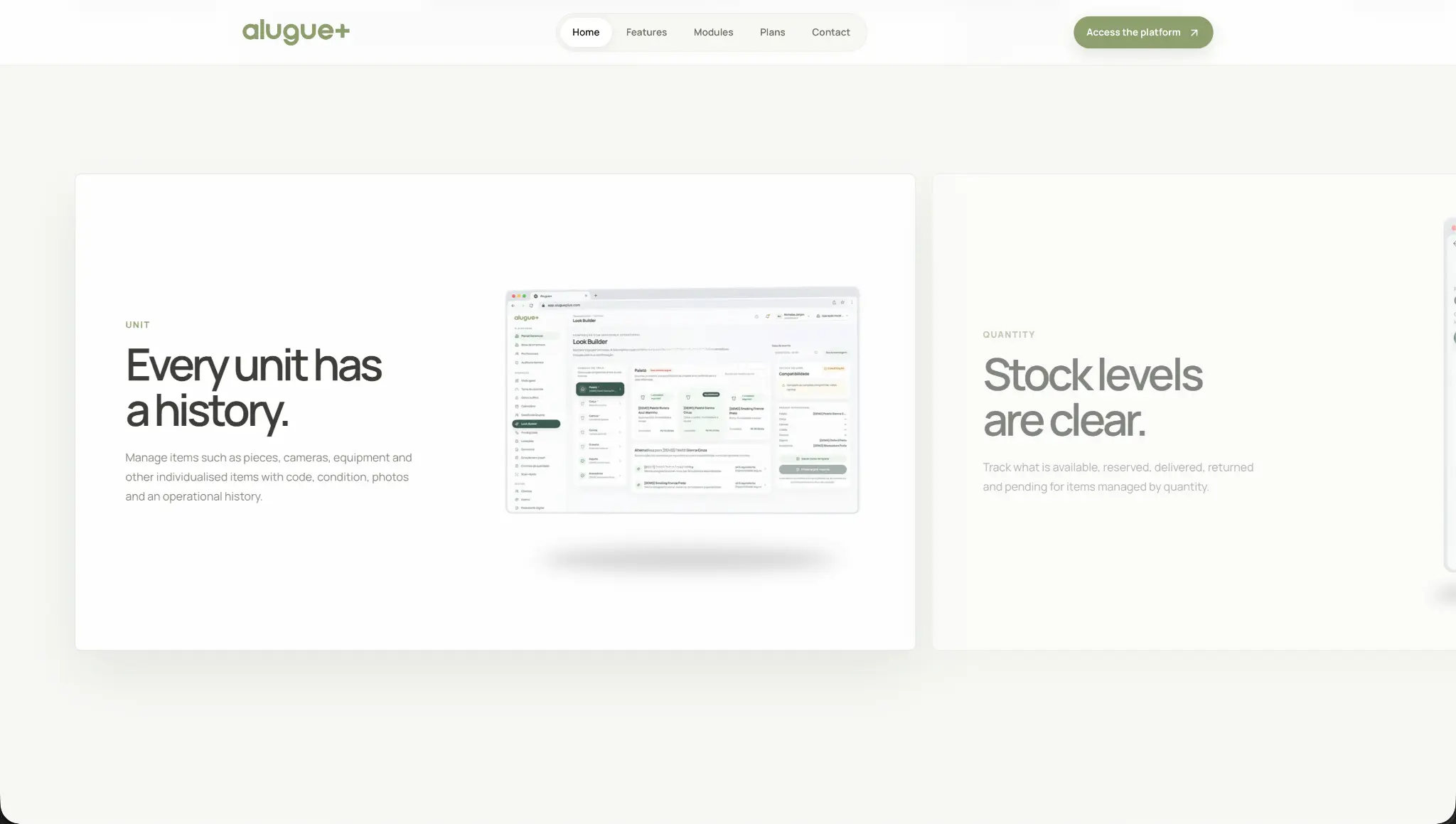
Fluidity here is not decoration. It is the way the product story moves with the visitor: from a single item’s history to stock levels, modules, plans and a useful conversation.
Clear spacing, familiar controls and direct language make each section quick to scan. On desktop and mobile, the next action remains obvious.
A page system
More than one
good first screen.
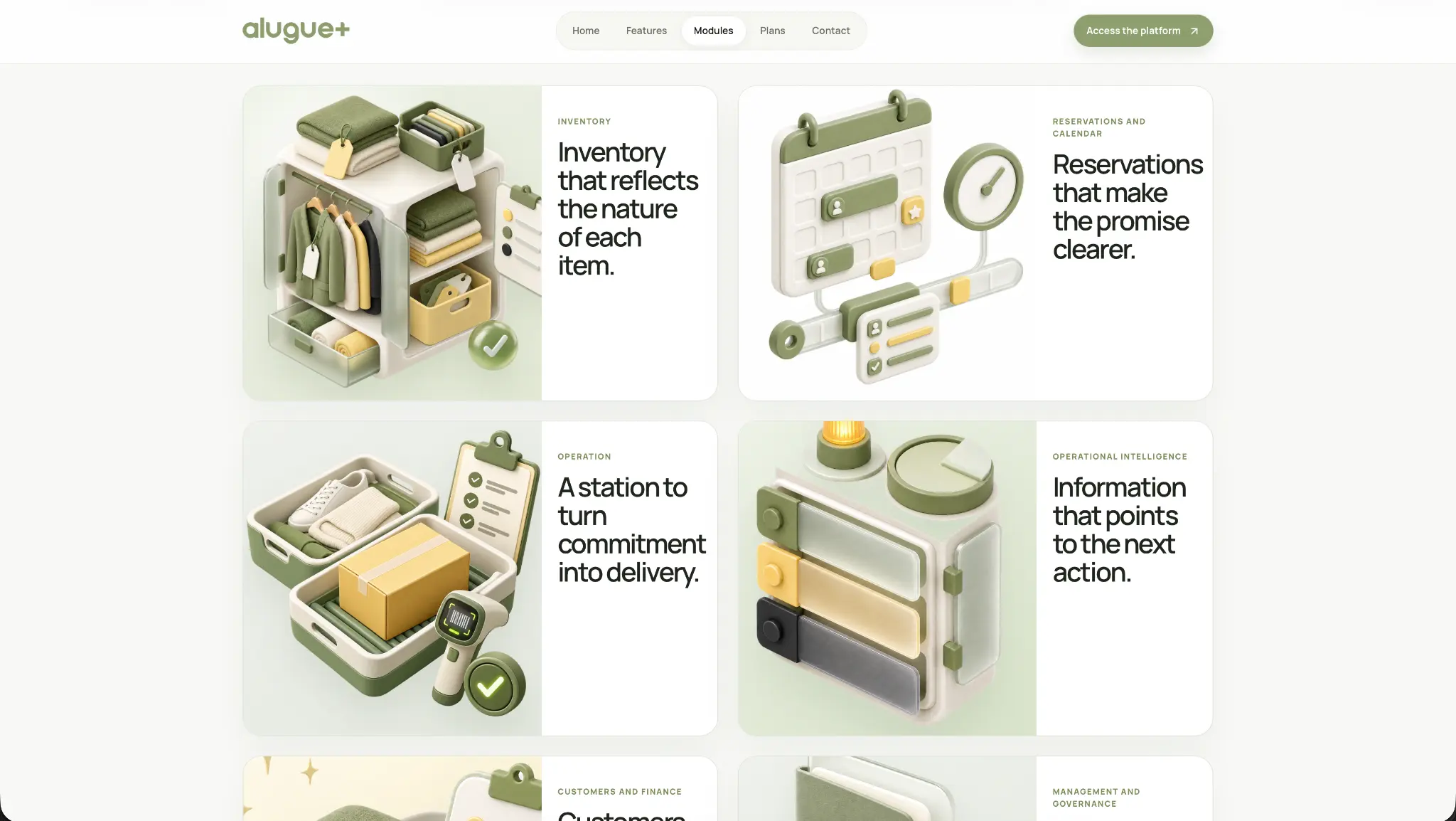
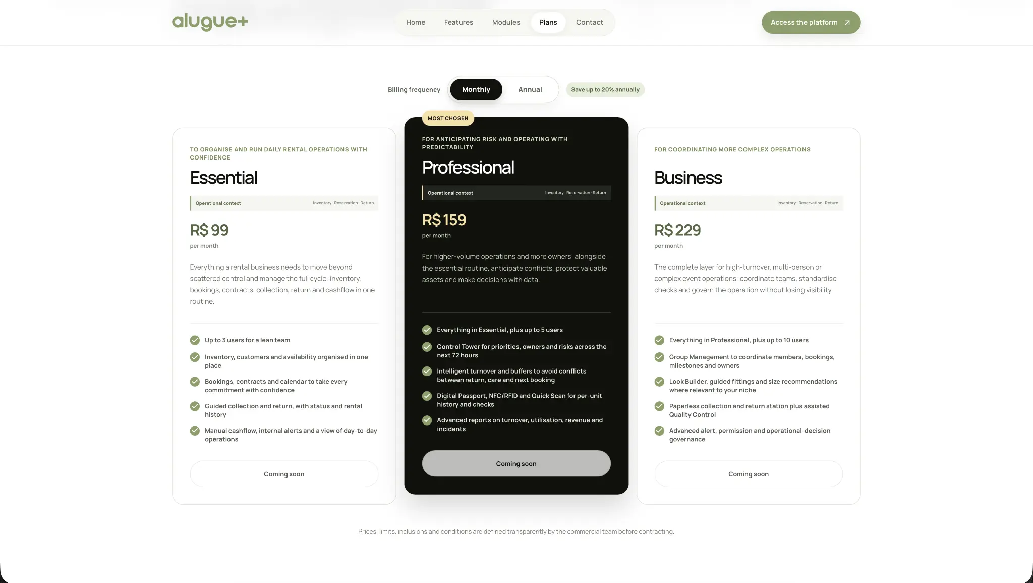
The product experience carries its logic through every important decision point. Modules explain the operation. Plans make the offer easier to compare.
The final step
A useful conversation
starts before the demo.
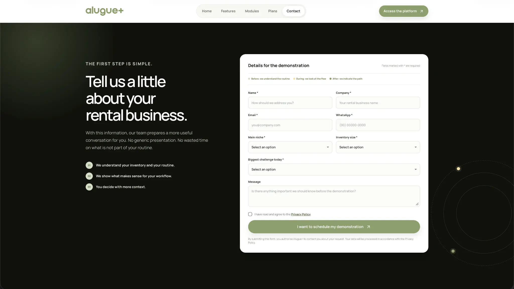
The contact experience keeps the same level of care. It gathers the right context, explains what happens next and gives prospective customers a simple route into a more relevant demonstration.
See the contact experience ↗